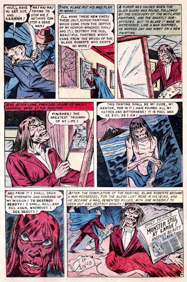
GCD notes that today's Baffling Mystery contains: "Unusually and uniquely bad artwork for Ace." And that it: "Could be a swipe artist's singular try." If you ask me though, the insane art (uncredited) only adds to the nightmarishly bonkers nature of nearly every single aspect of the story. See what you think, because it's still entertaining as Hell regardless... from the January 1952 issue of Baffling Mysteries #6.


5 comments:
Is GCD a bit harsh on this? Yeah, it's not great but I'm going to give the artist credit that he understood how comic art should be done.
Take the top of page 5; the first four panels are well staged. That said, if he was just lifting from other comics, you could see how that would come about. Still, it's not that awful of a job.
I really like Blake's crazy look. It's consistent throughout the tale and is a pretty cool monster. All the mumbo-jumbo about him being dead/non-dead/un-dead/etc is kind of useless in the tale, though.
The very last panel feels traced. I suspect GCD recognizes a lot of this from another story, which is why they said what they did.
I love this issue, thank you for sharing, i love horror art/comics and stumbled across your blog, i feel inspired as an artist! Whats your favorite vampire art?
Favorite vampire art for me is by Bill Everett, check the recent “Burton’s Blood”post this month by him, as well as “Vampire Beware” in the THOIA Archive here:
https://thehorrorsofitall.blogspot.com/2007/07/vampire-beware.html?m=1
Uh, yeah. When I read your into I was certainly gearing up for a rant along the lines of “while I certainly understand that many comics art fans reject material that falls expressionistically--or emotionally--beyond the fairly strict parameters of vernacular realism common to the form, I myself do not…” And yet I don’t feel like that argument is at all necessary, here. I’m hard pressed to know just what GCD was on about. The people are tolerably well drawn, to the usual formula, in well-constructed panels that elegantly convey chilling story beats and the through-lines of the plot. That last bit belies the idea that this is mostly swiped, by the way. I agree with Brian that the last panel is likely a trace. And the splash is pretty awkward (and my favorite panel!), what with that totally oddball outsider art car interior. But for the most part the art here is perfectly norm, and in many instances better than usual. My word, but this artist did a heroic job making that guy’s face shocking in panel after panel. I can’t really imagine anyone doing much better. I think the colorist deserves a hat tip, too
As for the story, well, that really does feel like it came outta somebody’s swipe file. Like the writer just upended a folder of neat clips he’d culled from other tales and let them fall where they may. Something about a man back from the morgue, an item about a hell-bound artist, the bit about some old lover’s ghost plotting revenge from beyond the grave. They did not, for me, string together as persuasively as the art did. Though, whether intended or not, it did deliver this great paradox at the top of page four: The gallery guard blocks Blake’s entry. “Ha ha ha! Trying to stop me? Nothing can stop a dead man!” screeches the walking corpse as he turns the guard into a dead man he will not be able to stop from stopping him. Stalemate! This is the sort of verbal problem you can short circuit a robot with.
The GCD opinion is just that, an opinion, and in my opinion they seem to expect all comics to be works of art rather than disposable entertainment of their day.
To put it plainly, 'What do you expect for a dime? Shakespeare?'
On page two, upper right panel, the wild staring eyes, a face hidden in darkness, he could have been a horror host.
Page four, middle right image, it reminded me of Pickman's Model, though the image here was scrawny compared to the well fed ghoulish horror of Lovecraftian lore.
Post a Comment