Time to finish up July 2024 with an explosively eerie triple be-header of Lawbreakers Suspense Stories via issues #10, #11, and #15. Yes sir, good 'ol decapitation days are here again-- as well as finger melting, and blowin' up the babes! Don't ever say that THOIA never delivers the gory goods, although today's "goods" could've used some better printing, and I did my very best to make these scans a bit more presentable. Ahhh well, can't blame a horror host for tryin'! And you thought we were done with Charlton too, eh? See ya'll in August for lots more...


5 comments:
I love you puppy, you are so cute! Realistic? Not with those Disney eyes but cute for sure!
The head story is fun because it shows the very fine line between crime and horror; the basic difference is a dog moving stuff around or the supernatural? That's one easy way to re-use scripts, for sure!
Fingerprint Removal is a lot of fun, you can see where it's going from panel 1 but there's great deck stacking that allows the ending to really pop. Every panel our dumb criminal does something to make him more deserving of his fate. Best art in the 3 stories, too.
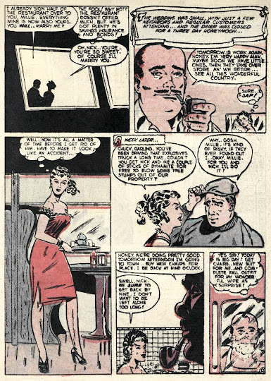
Explosive is an excuse to draw good girl art, but the story is actually really good. Sure, it takes a hundred coincidences to work, but it's a short crime comic and, again, deck stacking makes our gal very deserving of her fate. I appreciate the leg panel and obviously that's why it's there, but it does make the page a hard scan to read.
The faces Dennis Laugen drew look a little bit like Bill Everett's work.
Three surprise twist endings, with the last one ending with a Bang, an ending Hitchcock would approve of.
I almost always like lines about fictionalized celebrities, including the mash-up kind. In this case, "Tyrone Gable."
The most striking thing to me is when Dave turns out to be alive, that doesn't deter Harry for one sec. Dave was right about him being no good!
I love that utterly insane third panel of the middle story. Gangster Larry looks like an attacking mandrill.
The first and last panels of Explosive are an order of magnitude better than the art in between them. But it really does look to me like the same artist, and not some ringer. I guess he just applied his time and energy to the parts he thought were most important. It's a smart technique, I think, especially if deadlines are tight. It always seemed to me the best place to start illustrating a story was the middle, so the artist can get nice and practiced-up before tackling the showcase frames. Then, if time gets tight, dash off all the talking panels.
Lastly, I'm with Todd. Somehow the slapstick of the first story almost covers the rather brutal bit where Dave wakes up in the middle of his own burial. Because of the tone, the scene at first plays for yucks, like Monty Python's bring out your dead plague gag. And yet, the double horror here--the pitiable pleas of a doomed man on one side, and the nonchalant dialog with a murder victim on the other--kind of make my skin crawl.
More lastly, each of the covers on these issues are comically over-the-top violent. But #10 is like some kind of post-modern comics art mashup collage or something, ripe for reuse as a band flyer.
Lastlyest, I think you did a great job on the cleanup, Mr. K.
Post a Comment