"...this is probably one of the worst offsets I've seen in a while." said
Brian Barnes in the comments section of our previous story post.
"I'll take that as a challenge." replied
Mr. Karswell, who then proceeded to dig out a tale from the November 1951 issue of
Suspense #11, one that he has wanted to post a million times before but always thought the overly primary bright, shabby blob coloring, and off register red just ruined what is clearly one of the better
Atlas vampire tales of the precode era.
"Maybe there are copies out there that look better?" he often pondered. But no. All the pondering and back issue bin digging in the world would unfortunately never unearth a better looking copy. And thus,
THOIA ends out the month of August 2020 and sadly presents:
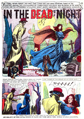


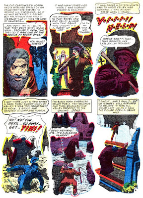


PS: I actually spent a small amount of time and cleaned up a lot of this, thusly 2, so it doesn't look quite as bad as it originally did. Enjoy! --Mr. K


6 comments:
Kind of telegraphed from the start that Walter had to be the vampire. There were only the two possible suspects, Walter and Katie, and since Dad obviously knew Katie it was Walter. I wasn't so bothered by the globby colours, the art was good, especially the swirling cape. Why do capes always need to blow in the wind? It would rather defeat the purpose of capes. My nitpick of the day is, if every victim of the vampire has no marks and the verdict is death from overwork,
1. How do the papers call it the work of a phantom killer and
2. What kind of vampire presumably leaves the blood content intact?
Yet another month of 13 updates! Only four more to go!
Can't believe this year is 2/3 over already.
Well, that was my mistake, I should have challenged you on something cooler than screwed up printing plates! :)
I absolutely love page 4! I love how the artist had to play around with the panel contents to get around the missing borders. Panel 4 is an especially striking image.
The splash is equally fine. This is a real good job on composition -- figures to the left/right, the moon in the middle and the trees/graves as borders.
The colors, yeah, even without the offsets the bright primary colors for everything is really jarring. I swore this was a Dick Tracy serial at one point! I can't image what this was like before you did the hard work of cleaning it up!
The writer tried a little -- well, a lot -- too hard on Katie the Red Herring.
On the last panel of page two, Katie watches Walter as he leaves the cemetery and heads home. I guess he was taking the circular route that time, huh? And did Walter kill Katie's mom and dad? The two slain men? The lost girl? Is Walter the same wampire who killed dad's coworker in England? Did he follow him to the New World like some kind of family curse? I like to think the answer to all of those questions is no. I like to think Walter's just an impressionable young man who got ideas from Katie's kooky family.
I definitely like the art here. Much of it feels like an appeal to classier work--those cemetery trees are definitely right out of an art museum. I like the heavy shadows, too. The silhouettes on the last page are eerie as hell. As for the color registration, or mis- thereof, I always find that look aesthetically pleasing. And this one's a peach! Only the cyan offset screen image is reliably in the correct registration from page to page. The yellow is often slipped one way and the magenta in the both the other two! It's amazing! I can't believe this is Atlas, who I'd have said enjoyed higher quality printing than most. I feel like the book itself must be evidence of some local catastrophe: The night somebody lost an arm in the press, say, and it took 'em two-thousand issues to find all the fingers. By then, he could never reprint all them pages in time with just his left hand. And now we are left with this beauty!
I saw this coming a kilometer away, but it's still clever. What an ingrate, though: even after she never once accuses you of offing her father, you still off her too? Jerk.
A vampire that feeds on victims without leaving bite marks, a new twist on vampirism. Maybe he feeds on their life essence or energies?
The last panel looks like he is headed for his basement apartment.
All in all a unique twist as far as vampire tales go.
https://www.atlastales.com/issue/3975 cedits Hank Chapman with the script and Pete Tomlinson with the art. Sorry, no credit for the colorist.
Wouldn't it be nice if somebody like Heritage Autions unearthed
Pete's originals?
I liked this a lot. Thanks for the extra work!
Post a Comment