
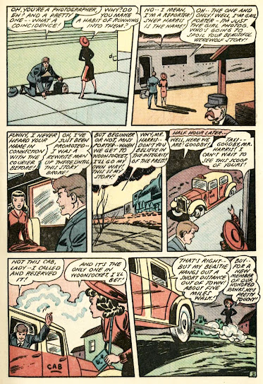
Like our previous post, we're keeping things cool 'n breezy, this time with a frisky fun Gail Porter "Girl Photographer" horror entry (our first Werewolf Wednesday post of 2025, too!), via the July 1944 issue of Blue Circle Comics #2. Gail only appeared in a half dozen adventures in her short-lived, comic book investigator / photographer career, fighting crime with a naturally smart ability, not to mention her neato infra-red camera! Her bitch ass editor boss seems to be from the same school of jerky blowhards that produced J. Jonah Jameson though. GCD believes that Bob Oksner is the artist here.


6 comments:
The choice of font is really irritating. I wonder what made anyone think it was a good idea.
The story is great, really. I fingered Shep for a real werewolf from the moment he appeared, but it was a pretty good bait and switch to have him dress up as one (in the same suit, too; how did he fit it over his wolf costume?)
While reading this I was distracted by the werewolf's rat tail. The costume maker needs a talking to. A wolf isn't a greyhound or a Great Dane!
I don't always go for those "Scooby-Doo" endings, but this one is perfectly all right with me.
>The choice of font is really irritating.
No it’s perfectly fine, this is typically a series about a female reporter, not a werewolf hunter
That is one well dressed werewolf! Gail is a beauty but shouldn't he be howling at Red Riding Hood?
The artist has a hard time with night, and colorist isn't helping, it's like the bad day for night shots in cheap horror movies, so I guess it fits. I love the wolf! It's really cartoony, and the guy went so far as to make sure the mask drooled! He's got a good career ahead of him if not newspaper guy.
Gail solves this out of pure luck; she happened to bump into him and he happened to drop the same thing twice! In a lot of these 40s stories where they were churning them out, sometimes the mystery solve is basically people dropping stuff!
I love the loopy stars over her head, don't see that often in comics of this type.
Those "plucky" female reporters (or male reporters of the same kind, for that matter) can wear thin for me.
Judging by this story, I definitely like Gail Porter.
The newspaper panel on page one is amazing. I assume that was some kind of last minute editing effort, changing "reporter" to "reported"? I've been here trying to decide it it was a Freudian slip or some honest-to-god attempt at foreshadowing. I'm leaning toward the former, what with the edit. But since this story predates Liquid Paper by twelve years, I knew the ending from right then.
I really like the art style here. It's kind of got a halfway-to-C.C. Beck cartoonishness that really sells the plucky vibe. And that is certainly within Bob Oksner's abilities, though I'd have never imagined this was illustrated by him. It's early on, though, so maybe I just don't know what 1944 Oksner looks like. The werewolf design is aces.
But I don't like the lettering style in this one, either. Just to be clear, I think the title treatment here is excellent, graceful and inventive. But it was an awkward and unconventional choice to present everything else in italics. And the shape of those esses is troubling to my eye. I think the point of lettering is to not be noticed, and yet I couldn't help but notice this stuff.
Post a Comment