
The putrid past collides with a perplexed present in this oddball tango with terror in a haunted house, via the December 1952 issue of Strange Fantasy #3. Being a Farrell story, the art feels distinctly non-Iger Shopish in a few places, (and GCD lists no credit), so this may have actually been illustrated by a combination of artists. Now the wonderfully clunky story telling / unintentional humor on the other hand...


8 comments:
The art is ... bizarrely interesting. So many face close ups! How many up the nose close ups do you see in comics? There's a bunch here! Some place, like panel 3 on page 1, feel like they are traced.
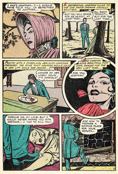
It is like the artist -- knew they were bad at drawing figures so stuck with faces as much as possible. Look at page 2, the faces are good but the figures (like panel 2) look like children. The second to last panel is even odder; it looks like the artist was trying to do perspective and just ... could not.
It's super fun to look at. It's all over the place! It's fine work in places, and amateur in others but it does feel like the same artist? Maybe?
BTW I don't want to act like I'm crapping on this artist work. It's full of great stuff! It is almost like somebody who did face drawing for a living decided to earn some extra scratch working in comics.
BTW the splash figure is perfectly fine!?!?!
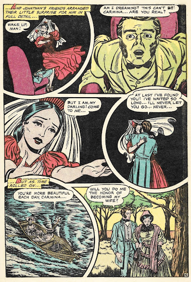
I need to come clean here. I hate splashes that end up having nothing to do with the actual story being told. Much like how some comic covers feature a scene from a story that’s not actually in it. (I think the cover of this comic issue is a guilty contender for this) Needless to say, the splash is the most interesting part of this comic despite is being denied an actual dancing girl ghost. The entire story hints of her haunting the place but in reality, all we get is a rather sick murder story of a man who just couldn’t let go. The closest thing we get to the supernatural is the couple falling asleep due to the sherry and sharing the same origin story behind the rumors.?Heck the couple isn’t even necessary to tell this story but it still works pretty well. Funniest part to me is when John takes the poisoned rose and places it between his teeth as well. That’s a new way to commit suicide.🤣
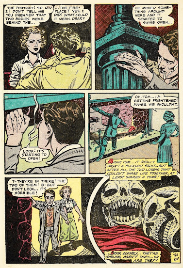
The last panel is ....... interesting. I can't make up my mind whether whoever drew it couldn't draw teeth (though his rendition of skulls is competent) or whether he intended them to be monsters). I'm a dentist, so this kind of thing draws my attention immediately.
Definitely a mishmash of art styles. It almost looks like one person did the faces, another the bodies, and maybe a third the backgrounds.
Some of the art looks more sixties style than fifties type of work, the images would not be out of place in a romance comic a decade later. As to the plot, it would not have been out of place in a 1960's-1970's Charlton horror comic. Things happen, but they are not over the top scary, it is more of an urban legend type ghost story or a one pager stretched out to tell the tale.
I agree with Glowworm concerning the teaser splash, it wouldn't have been impossible to draw the dancing specter hovering over the two modern day lovers while they slumbered. Today this would be called clickbait, though back then bait and switch would be most accurate.
This was an interesting filler tale, with the artwork as the main star even if it is a bit uneven here and there.
As always, thanks for filling our days with these horror comics from days past, Karswell.
Yes, it would make a good Charlton story.
With a few little opening and closing comments by someone like Mr. Bones" or "Winnie the Witch."
I'm not sure what the modern couple were expecting to find at the end there that made them so surprised by what they did find. I mean, yeah, the evidence that their shared woo-woo was right on the money likely shook them up some, but the dead folks they found were just exactly as advertised. So where's the twist? I mean, I'm not addicted to twists or anything--I like a story that resonates with fatal inevitability, too--but this one sure feels like it's unveiling some kind of surprise that I'm just not detecting.
As for the art, I keep wavering. I'm not totally convinced what we are seeing isn't just some pages being more hurried than others. Obviously plenty of love was lavished on page one (I love that artist's easy facility). Page two is obviously the same guy, but the figures do seem rushed at the top (though the illustrator nailed the tricky couch image perspective at the bottom, at least to my mind). The next page really is a bit of a change, and may indeed be a new penciller. The work is definitely a lot more locked down, and slightly cruder, but there's no since it was hurried--the opposite actually. It's very careful; more labor intensive than the first pages. I really love the clever image of Tom sleepily eyeing his sherry, his ghostly eye floating in the lens distortion of the curved glass. I'll point out that this period bit from the middle of the book ends four panels into page six, where the art changes back again. So maybe there was some strategy at play to give the different timelines different feels. Might be different artists, or maybe just one, but trying on different looks. Either way, the last page is a rushed mess, which is too bad.
I sure stared at this one a lot more than usual, though!
Not sure why so many stories in the 1950s ended with some lovesick man killing a woman and then himself, but I'm glad that trope seems to have died down.
Hmmm, not sure what desert island you're living on Todd, but if you honestly think suicidal lovesick men (or women) killing the opposite sex has ever for a single moment died down in comics or movies etc., well, you must not be engaging in much modern horror.
Okaaaay, one more story for our February Love Fest o'fright, stay tombed...
Post a Comment