
The December 1952 - January 1953 issue of Witchcraft #5 is a wild collection of stories, and sports one of the greatest precode horror covers of all time, masterfully created by King Kelly Freas. And with this final A.C. Hollingsworth zombie tale post (boy, did someone seriously drop the ball with that splash page title treatment-- PU!), I do believe we have now posted the entire issue here at THOIA. A lovely Everett Raymond Kinstler illustration on the inside front cover is the icing on the cake! Check the archive for "The Witch of Shadow Glen", "The Warlock of Manescue Manse", and "The Witch of Death!" for more!


8 comments:
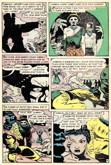
Jack Carney sure does think his own laughter a lot. That's weird, right?
That title treatment really is a puzzler, but I see the whole issue is like that. Those are probably press-down letters. The cool horror titles we're accustomed to are usually drawn by the letterer--along with balloons and even panel borders--but here all of the stories in this ish are done by a Leroy lettering machine and maybe there was just no competent hand letterer around to provide those other kinds of things. I note that the balloons are pretty inept, too (page three, panel five is a particularly derpy example)--and a letter's other main function on a comic book, the sounds effects, is a completely missing element. That's why we never hear those drums they keep talking about.
I didn't look through any other Avon titles, so I don't know if this was business as usual for the company or not.
Truly sweet Holligsworth art here, but that cover kind of overshadows everything.
>That title treatment really is a puzzler, but I see the whole issue is like that.
Yeah but the other stories are all presented with an introduction narrative box so the press-on letter style works ok enough within those confines. With this zombie story though, Hollingsworth clearly left a ton of space at the top for someone to do something interesting, --I mean come on, they couldn't even increase the size of the press-on letters to avoid looking awkward and ill conceived? haha
Oh I know. The text box is there, they just decided to cram it onto that tombstone instead of putting it at the top. I like it that way, but it doesn't even really fit. They should have put the title on the stone instead.
Far as I know, the only way to enlarge the press-on letters would have been to letter onto a separate art board and make an enlarged photostat, cut that out, and paste it into the line art. Assuming they had a camera. They absolutely should have done that--agreed!--but I sense they were kinda cutting corners.
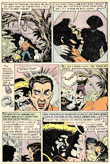
Jackie boy there really did not know when to leave well enigma alone, did he?
Despite the butchering of the history and practice of Vodoun and Obeah (which are of chose not the same thing) here, this was a good story, especially since for once we see the zombies being used in a helpful way. And don't get me started on Romero zombies. I would gladly feed Romero to one.
As for the cover, if I hadn't read from your intro that it was 70 years old I would never have believed it. It's better than any drawn these days with the help of computer graphics. Wow!
So the art on this is excellent -- and I like the nearly manga eyes on some of the ladies (decades before that style emerged, this is more like a Disney lift which is where it came from originally.) Page 4 and page 5 have great examples, and it really sticks out.
This is another stacking of the deck tale, man, Jack is just a complete and utter a** throughout this thing. There isn't a single second where he doesn't do something to deserve his fate!
I love the B&W coloring of the zombies, especially when they have the white dotted eyes. It's a great effect, and the shadow/shading of the splash is something that would have been cool to repeat throughout the story.
This tale features some of Hollingsworth's best work.
Hollingsworth's work sometimes looks like low end underground comix work or illustrations found in a fanzine.
While Hollingsworth's work will never be in the same league as Lou Cameron or Russ Heath, it has a unique charm all its own, uncanny valley type art is the only way to describe it.
Another original thing is, VISUALLY these have to be nearly the least stereotyped Caribbean natives in horror comics (at least among voodoo practitioners). especially Nara. Sure, that's "good girl art" type titillation, but whatever you call it, the story goes out of its way to make Nara not only dignified, but really hot.
Nerodart sa`ys...
And congrats to A.C Bollingsworth. A perfectt style for the story!
Post a Comment