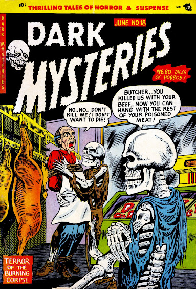
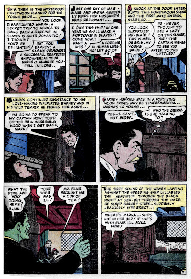
If you've been paying attention, the last three story posts have all been from the June 1954 issue of Dark Mysteries #18, and todays A.C. Hollingsworth illustrated tale is no different. In fact, it's been a while since we've had a full issue presentation around here, so let's finish up this 4 course banquet of cut-up corpses, vampire creeps, and (now) cannibalistic brutality! We even have a great Hy Fleishman cover! Hope everyone had a terrific time with this one, maybe we'll do another in Dec!


6 comments:
It's interesting this had a "3D" splash but nothing else like it in the issue!
A fun tale with a good wind up, but could have used some editing. It stuffs way to much into the last page. I would have removed the cheating angle and just made her mad at him for being a slaver -- that should be enough for anybody -- and then spend more time on him being in a frozen state, reveal of the anticipation a little.
There's a lot of interesting art, I like the menacing blacks in some areas but I wonder if that was something else involved with an aborted 3D process? It's kind of weird there.
Thanks for the full issue!
What a chilling tale, the antagonist about to get his just deserts by becoming the main course.
I somehow think cannibals wouldn't be too picky in eating the dead, though I know next to nothing about cannibals except what I read in horror comics.
A more twisted twist ending would be if the undead witch doctor would be restored to life by eating a living victim, namely, the one who killed him in the first place.
Hollingsworth's art is quite good in this tale, though good work by Hollingsworth is a low bar to begin with.
This tale may be similar to poverty row horror films (low budget, questionable storyline, weak script) but even the low end B movies can be entertaining from time to time.
Thanks for this comic post, Karswell.
This should have been at least a couple of pages longer; it almost looks as though the artist was suddenly informed that the story had to be wrapped up within a fixed number of panels. That said, I uncritically love the concept of slave raids carried out by people in modern clothing, armed with modern revolvers, and equipped with flashlights.
I have to admit that the central absurdity here charms me a little bit. Imagine somebody refusing a burger because they only eat "living cow!" I mean, part of the process of rendering meat is killing it, yeah? Okay, so I get it--these are cannibals recast as comic book ghouls, gotcha. It's in keeping with slavers remade into mustachio-twirling* heavies, etc. But just being slavers isn't too villainous, apparently--the damsel falls in love with "a good slaver," and the story's horror hinges on his unjust fate and her vengeance in his name. I get that, too--here's a story that wants us to believe it is against the persecution of African people while also presenting them as monsters.
This same ish gave us concentration camp Nazis a few stories ago. Sheesh. I'm not sure either story finds enough fault in these activities for my tastes.
Something to note, though: The finale of this one (and its splash) includes both types of 1950's zombie just as the concept was moving from one to the other. Here we have a curare-addled living person enslaved to the will of a master (kinda) and a legitimately dead (and speedily deteriorating) corpse risen from the grave--all in the same room with human flesh eaters. I don't know if you can find a better one-panel recipe for what zombies would become over the following decade. It's also a little bit like a zombie version of that meme with three sixties animated Spider-Mans pointing their fingers at each another.
* Blond mustachio, by the way. Which strikes me as pretty fashion-forward for a brunette from back in slaver days.
I have to admit vague disappointment that we didn't get the story on the cover. But this one was quite fine. The idea of a "good" slaver is a very weird one though.
The "3D" splash and all black border indeed makes it look like one of those ACG "TRU-VISION" stories, possibly it was originally intended to be for that series-- before terror struck!
Anyway, great comments, love reading the positive things people enjoy about the stories instead of just the endless MST3000 style snarky jabs, so as always, let's keep it fun and interesting around here!
So you guys know I don't post much superhero stuff around here, but we'll see Captain Marvel Jr. in a jolting tale of terror next! STAY TOMBED...
Post a Comment