It's
Double Header Fish Fryday for you today, with both main courses guaranteed to twist their deadly hooks in ya! The first story is from the December 1953 issue of
This Magazine is Haunted #14, (the final issue of this spectacular series in fact), with art by
Bud Thompson, --followed by a rather painful quickie from the April 1954 issue of
The Thing #13, with possible art by
Chic Stone. Have a great weekend fiends, and don't choke on any fish bones!


7 comments:
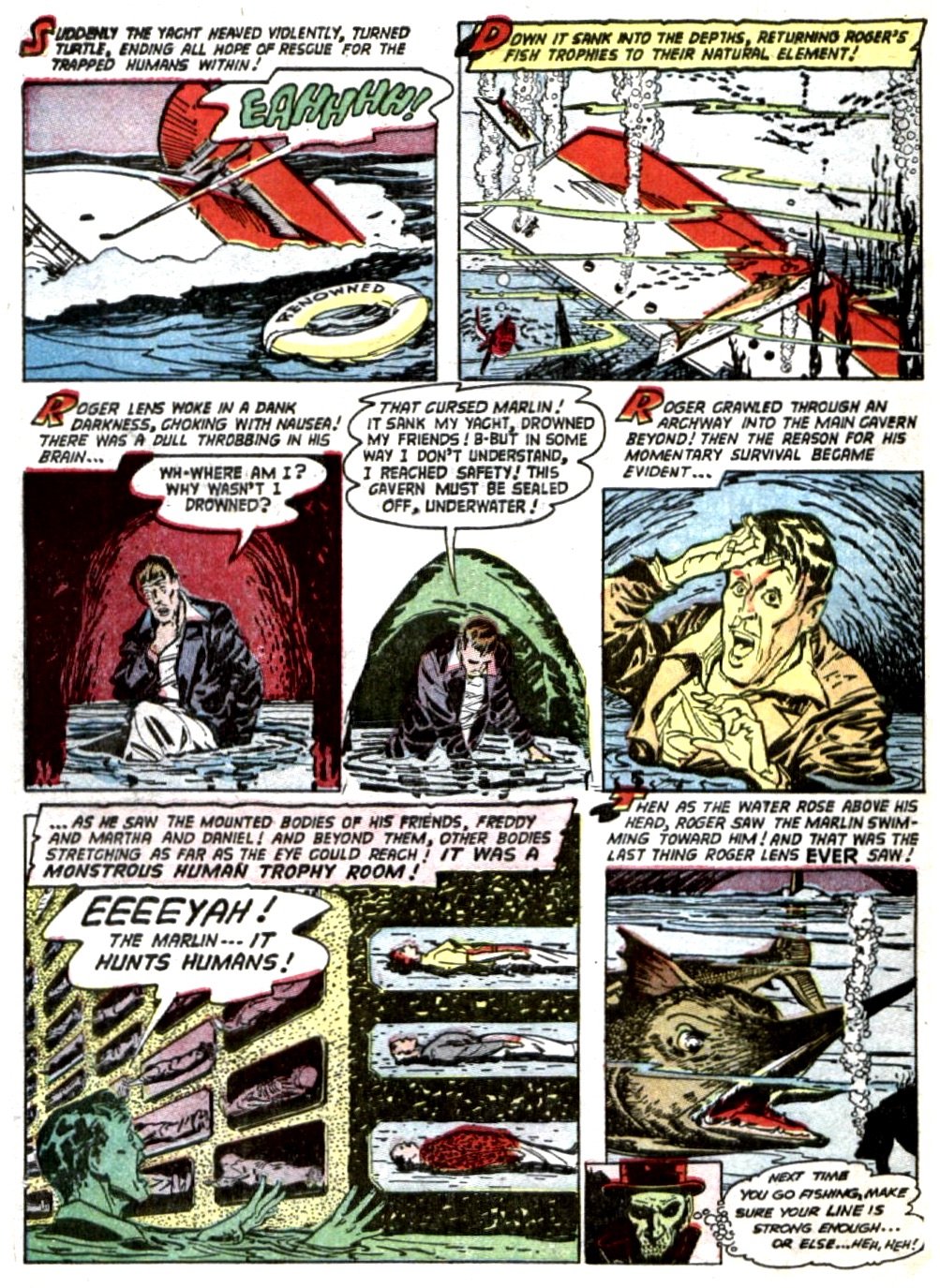
I do love a story that gets right down to the impalings. Sometimes it seems like I have to wait around forever. And if anybody out there is collecting good gaslighting panels for ironic use fighting the patriarchy, I think that orange and blue frame at the top of page four is solid gold. Stop acting like a fool, Martha. You've only got one more page to live. Try making the best of it.
The second story feels a little padded, even at four pages. I like the work (I especially like the way the protagonist looks like Beavis all grown up), but the splash is a little bit wasted here, and the ending really needs a full-on skeleton panel. I love all the parts in between though.
The museum security guard looks like an early version of General Ross.
I'm kind of sorry for Rod, and that's partly from seeing so many BARNEY MILLER episodes. Barney and the others were pretty lenient with muggers who were just as bad as Rod, or a little worse!
To Mestiere: I appreciate you not implying story of Jonah is fictional like some would.
I feel bad for Rod but not Roger. Rod deserved it but horrible way to die.
The art on Death Fish is great, and the artist either really knew his fish or did research ... or maybe made the whole thing up because I have no idea if those labels are correct or not!
The red haired woman was just added so the artist could draw a pretty girl, those characters actually meant very little to the story, it could have just been him and the captain and the story would have worked the same way. There's parts where the inking is a bit overly heavy, but the coloring is great, the art works well, and the artist has a real eye for action.
Yes, the story on both of them is pretty predictable, but that's fine.
Poor Fish's art isn't as nice, but likable. Script didn't need to pound the "little" or "poor" fish into use with every balloon!
Two fun fish stories!
Shades of Dr. Seuss "Red fish blue fish" Then holy Jerry Lewis more intelligent/manlike animals. Maybe it's all the 50's radiation from atomic tests? Did not see that ending coming even after the human paper. Enjoyed it. The violent crime tale was a bit of a gritty nasty diversion. Was that a severed hand? Strong effing fish faces. Thank you Mr. K. Watch out for hooks.
Didn't fish encyclopaedias exist in the 1950s so the artist could check what a Piranha looks like?
Post a Comment