The
Seduction of the Innocent 80's comic book series from
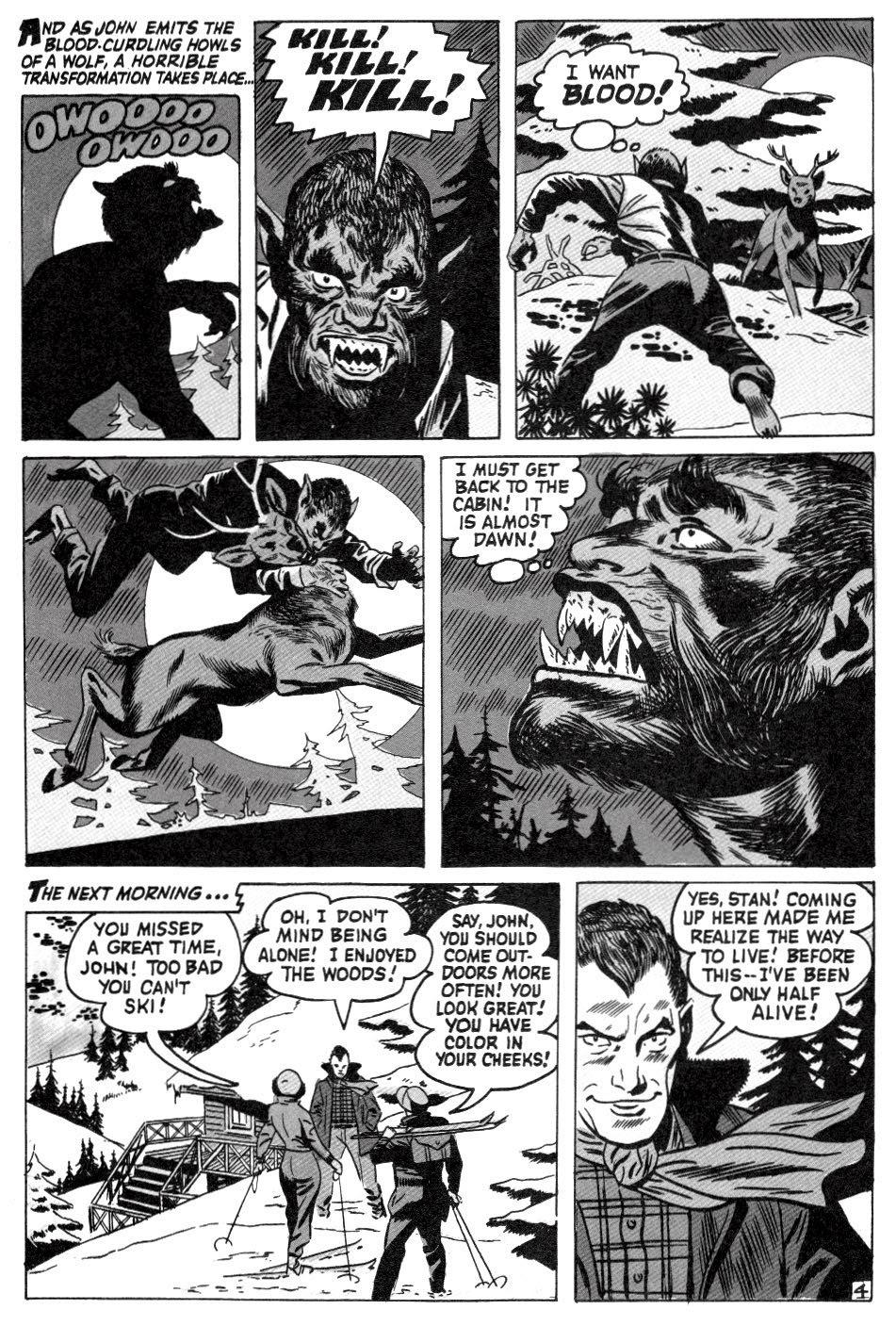
Eclipse is a good source of info for precode horror reprints and other related items concerning hard to find golden age stories. Unfortunately, their atrocious re-color process of the stories seriously makes me want to claw my eyes out, so I dumped the crappy color "upgrade" of this
Sekowsky / Andru (???) werewolf tale, originally featured in the March 1953 issue of
The Unseen #9, simply for the fact that I thought it would be nicer to look at the line work in black and white instead-- and if you don't agree, I don't care...


14 comments:
My only complaint here is that this should have been posted on Werewolf Wednesday! Otherwise, this is really nice stuff.
I agree about the super slick modern colour "improvements" being anything but. I struggled with that very thing while I've been drawing up my horror comic sample story, and ended up using watercolour and coloured pencils with a bit of digital augmentation. Otherwise I just couldn't get a feeling of "life". It's all about texture and imperfections. These old horror comics get that thanks to the reproduction process they had.
The story itself was very nicely drawn and full of interesting choices. I LOVE that last panel on the bottom of page 5!
That cover is awesomely crude and cheesy. It looks like a forbidden horror comic from put out by a publisher of 1950's "Tijuana bibles" or something. Fantastic!
Thanks for posting this on Furry Friday!
>Furry Friday
Haha, perfect!
I agree with you good Mr. Karswell... Black and white does allow a much better view of the line-styles used....
One reason that we liked Creepy and Eerie so much....
.... as always ...You have a truly Great Blog...
Thanks, Doc!
Even though I don't know any version of it VERY well (including the novel), it's easy to see ISLAND OF DOCTOR MOREAU influencing that one scene -
"What have I taught you?"
"Not to eat meat. Not to run on all fours."
...or Feral Friday?
I am amazed how good this looks simply desaturated. I mostly dislike modern recolors too, but I really can kind of see their utility here, where the nice, boring, even recoloring makes a thoroughly tonal graywash when desaturated digitally. I can't imagine the original precode coloration working nearly as well, with all its halftone screens and cyan-dominant blues that would muddy-up, disappear completely, in black and white.
Anyway, it's a good idea for presenting a great story--especially art-wise. I love all the bold, poppy work here. Page four is totally magnificent. This one is truly mighty.
Thank You Karswell for making this story black and white. It reminds me of the B/W werewolf movies of the forties and fifties, it has the feel of a B movie, which is never a bad thing in the realm of horror.
Even not so good to downright awful B horror has its place for horror fans. For those of us growing up in the 1950's through the 1980's, B horror was a staple of our late night TV viewing. Unfortunately, the horror TV experience, with or without a horror host, much like fifties horror comics, can never be fully recaptured. All of us who come to this blog are grateful to you for finding all these great horror tales, and we are doubly grateful that you have brought them back from near oblivion for us to enjoy. As I said in the beginning, Thank You Karswell!
My pleasure-- I'm just glad you guys keep coming back for more!
One of the great joys of Yoe's Powell book was the couple stories that were reproduced directly from the pencil art; even EC who had probably the best colorist in the business sometimes looks better, IMHO, in B&W. Sometimes the color is a necessary component, but so much fine line work is lost in the coloring and in the crappy paper and printing methods of the day.
This is 4 or so years before "I was a teenage werewolf", and knowing production schedules, probably really 2-3. Did this have some influence? Probably not, but there is some similiarities.
"Don't eat meat. Don't walk on all fours. You're human, not a wolf. Well, after 6 years with my background in the medical field, I've taught you all I can."
Interesting subject. I'm not prejudicially against recoloring, but it's a delicate matter and I have to be very cautious for lack of comparison.
In the Seventies I read the italian version of many Marvel-Atlas stories posted in this blog (the one with the planet-eating creature for instance). Well, the standard treatment back then was to reduce them into "pocket book" size, and they were always presented in black and white (cheaper). I was positively impressed by the color version.
On the other hand, Gene Colan's Dracula is way better in B/W to me.
I really liked the recoloring of some Wolverton's stories made by Steve Oliff for Eclipse in the Eighties, but again, I only knew the B/W version, and Oliff was considered a genius round here in the 80's...
If I'm not mistaken, the poor werewolf shows all the distinctive marks ... of the vampire.
The new Howard Nostrand book from IDW / Yoe Books has a outstanding selection of non colored stories from the original art-- it's a must have collection!
dear sir,please allow me to disagree with you,i have this series from Eclipse comics and i like them very very much,Eclipse did a fantastic job and in my hubble opinion deserves more.Thank you.
I'm glad they put them out too, just not happy with the amatuer recolor of the stories... there are examples in my archives
Post a Comment