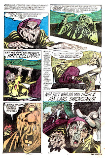
Instead of two stories from one particular artist for today's post, I thought I'd share two tales obviously inspired by the same literary horror tale, and in this case it's Henry Kuttner's awesome 1936 Weird Tales classic The Graveyard Rats (essential Halloween reading if you haven't already done so!) The first bite comes from the April 1952 issue of Adventures into Terror #9, (art by Dick Ayers), while the second rat tail comes from the March 1954 issue of Horrific #10, (art by Rudy Palais.) Both stories were originally featured on THOIA in our first month of existence-- July 2007!
The Best of From the Tomb-- now available!
Click HERE!


This comment has been removed by the author.
ReplyDeleteVery nice, thanks for sharing.
ReplyDeleteI echo Mestiere- what's with that final panel?
ReplyDeleteWhile the final panel of “Ghouls Rush In” is out of left field, this would hardly be the first for pre-code horror. I think that it was most likely just an attempt to amplify the horror, but it may have been an attempt to dodge an infringement suit. (Indeed, Henry Kuttner was still alive when these stories appeared.)
ReplyDeleteAnyway, I think that this was an especially well-considered post.
Cool Corbin illustration, Halloween Greetings to you Good Sir... from the "Crypt"
ReplyDeleteCorbin?
ReplyDeleteI wonder who did the script for the Atlas tale? It seems a little wordy for Stan, but has a very Stan-like ending in it.
ReplyDeleteIt seems, to me, that there was a perfectly good ending and then somebody else (maybe Stan, after another writer) thought to ad this strange stinger there. It's certainly out of left field.
I think the second story actually has a worse mistake at the end; the gist seems to be the rat is saying "I'm Satan", but it seems to be coming from the man. I had to read it twice to get it.
Still, both are fun stories with some great art.
I love the crazy, gnarly Rudy Palais art, except for those goofy mice--they look like hoppin' mad geezer versions Jamie Hewlett kangaroos. The first story looks good, too, but might be missing the yellow pass. Personally, I like it all light blue, though--even though that makes it seem kind of modern. I'm glad you reposted these. I had forgotten all about them.
ReplyDeleteOne more double feature for October to go-- it's been an interesting month and I really appreciate all the continued comments and support of the IDW projects. Thanks again everyone, see ya on Halloween!!!
ReplyDeleteRichard Corbin cover illustration..
ReplyDeleteit looks like his work..
Love the art of Rudy Palais. I just realized that R. Crumb's brother, Charles, was hugely influenced by Palais' art, just look at all those folds and wrinkles!
ReplyDelete