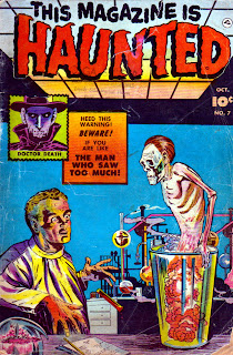
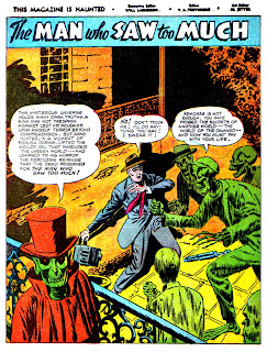
As some of you continue to roam the dusty halls of the THOIA Archive in search of an answer to our contest question (see last post), here's an epic supernatural Fawcett 10-pager from the Oct '52 issue of This Magazine is Haunted Vol. 2 #7. There are some nice atmospheric touches here, anyone know the artist? [Turns out it's Leonard Frank, though the cover artist is unknown. -- Nequam]


Aieeeeeee! Nice macabre story.
ReplyDeleteI don't know who the artist is but the colorist needed to be tossed into the fire, too! :)
ReplyDeleteNot a bad story, it's always nice to see on that doesn't rely on a EC-ish ending.
Agreed, to both comments!
ReplyDeleteVery cool. Thanks.
ReplyDeleteahh the mouldy veil!
ReplyDeletethat was great and so is the cover..still one of my favorite comic book titles too.
when you say you agree with both comments, does that mean that you agree with both points of Gumba G Gadwa or with his remarks and those of Diandra as well? just wondering...
ReplyDeletei love the lurid colors!!! what an exciting time for comics those whacky fifties!
ReplyDeleteThank you for all of your wonderful posts and thanks for giving me the idea to post my old 70's horror comics....Your "fiend" and Follower ....Dr. Theda
ReplyDeleteI agree that it's a nice macabre story that doesn't rely on an EC ending!
ReplyDeleteThanks for the comments, lots more on the way!
I usually like the seriously psychedelic-colored ones too, though I don't think I've ever seen a more dazzling instance of a colorist trying so hard to jazz-up what he obviously thought was otherwise really pedestrian artwork. I read these pages as a battle waged between different philosophies of illustration, and I think the resulting mess--interesting as it looks--doesn't service the story as well as artistic harmony might have. Because the story is excellent.
ReplyDelete(Even though the writer obviously didn't know the first thing about New Orleans. Tangled streets? Sheesh.)
Why is the scientist on the cover staring at the ghoul's crotch? Oh the horror!
ReplyDeleteThe artwork and the coloring is a mess, but it's a hot mess. Very entertaining.
I LOVE THIS! The colours are absolutely incredible! You've really been putting up some fantastic stuff recently. Thanks for existing! It makes me smile every time!
ReplyDeleteSincerely,
{theEye}