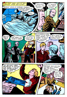
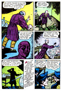
The living dead come in all shapes and sizes-- and sometimes they even come in jars! This is a weird one with a well used "brain" theme found in many pre-code horror tales, this time courtesy of Farrell Publications and from the March 1953 issue of Haunted Thrills #7.
More killer corpses-- available everywhere today!
Click HERE for info!


There's no horror like old horror. personal favorite are the horror from EC. it must have been an exciting time to live in. At least until Wertham published his unmentionable book and the witch-hunt began.
ReplyDeleteGreat blog you have; introducing or re-introducing folks to such a vast number of great horror comic stories is an epic public service.
Cheers!
I have a collection of bottled brains in my cellar and it hasn't affected me at all!
ReplyDeleteKidding.
This is quite distinctive artwork for ye good ol`Iger Shoppe.
I would like to someday (!) try and identify different Iger jobbers.
This one seems to be none of the usual 'horrorists'.
The splash on this one seems hardly related at all. Why does the doctor suddenly have an arm from somebody twice as big? Who's the babe? Who's the giant zombie head (note: looks nothing like the killer!)
ReplyDeleteThis one has nice panel layout and some good art. Never liked the glug of text before the final panel, it has a way of stopping the story dead in it's tracks.
I'm pretty sure Doctor Norton is operating on the wrong part of the corpse at the bottom of page two. Priapism may be heartbreaking, but it's fairly standard in cases of electrocution or head trauma.
ReplyDeleteI love the awesome Halloween vibe on the cover of this ish. And not to completely disagree with Mr. Gadwa, above, but I don't like the panel layout here. Circular panels have to be used for some reason or they just look gimmicky and old-fashioned to me. In this particular story they actually seem inept. The fancy panels here would, in every instance but the first page, probably work better framing the image right beside their current placement. Look at page four--the establishing shot of the couple in bed is highlighted in such a way that it actually steals momentum (and space) from the important action panel to its right. Or how about page five, where that anxious radiating head just screams for this kind of focus--to break out of its box--but the circle is given to the next panel instead--ostensibly so the artist could fit that wonderful table lamp into the top.
I do like the twist beginning, though. Goofy as it is, I really dig those crazy lurid eye veins.
Mr. Cavin wrote:
ReplyDelete>And not to completely disagree with Mr. Gadwa,
>above, but I don't like the panel layout here.
Blasphemy! :)
I'm thinking if the facing pages started at page 2, that pretty much puts each circular panel close to facing each other. The one on page 5 is bizarre without that explanation, though!
i really think i'm going brain dead from reading all these goofy but, oh sooo fun to read stories. Who needs a brain no-hows?
ReplyDeleteBrains are icky! But even ickier is Adolf Hitler. Who's ready for a Pre code Hitler yarn?
ReplyDeleteYes! I can't wait!
ReplyDeleteMany thanks!
Put on your Ratzi fighting gloves-- it's up next!
ReplyDeleteThis story was re-done in one of the horror magazines in the 70's. I remember the text being the same word for word, but of course the art work was inferior.
ReplyDelete