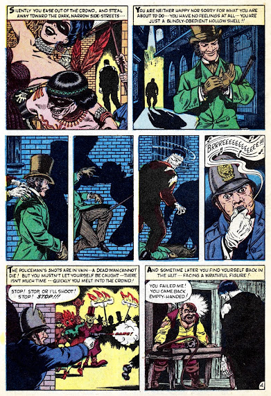
Time for the grandaddy, livin' deader of 'em all-- "ZOMBIE!" by Stan Lee and Bill Everett. And yep, like most of the Everett illustrated stories featured here over the last week or so, this classic can also already be found in the THOIA 2010 Archive HERE, but it's the black 'n white reprint version... I'm not sure how we went this far without the original color version. And along with that iconic cover (also by Bill), this is a fabulously fitting, and extra eerie way to end our monstrous Menace Fest-- hope everyone enjoyed it! Lots more on the way, stay tombed! From the July 1953 issue of Menace #5.


So this is, canonically, Simon Garth, who had his own B&W magazine in the 70s and has been sprinkled throughout Marvel comics for decades. Like Groot and Fing Fang Foom (etc) it is kind of fun to see this pre-code stuff (and the post code giant monster stuff) get worked into the Marvel U as a whole.
ReplyDeleteThe 3 panel whip, the 4 panel attack, there's some great Atlas cinematic moments here. Everett doesn't miss a chance to draw pretty girls and the zombie master is a great character.
BTW: Interesting tidbit -- when this character was pulled to be in the magazine, he was given long hair for a better look, so when they reprinted it (which is in your archive) they altered the art to give him long hair! It's fun to look at both side by side and see all the art changes they made.
And in the later version, his daughter is blonde, with what I guess you'd call a classic early ' 70s look (though not what you'd call a stereotyped look).
ReplyDeleteYou know, I get why they might have wanted to change this art to reflect the seventies version of the character in the reprint, but I have to say it's the first time I've been delighted that what we were presented with in TALES OF THE ZOMBIE was some color-leeched abomination, with melted line work and crushed-out blacks. It's comforting to know that the original boards had not been defaced.
ReplyDeleteBecause holy smokes is this story totally rad. I love the fine detail in the art. The ribbed leaves on the plants and shaded timbers of the house. The somehow buff and yet also skeletal protagonist. The star-spangles revelers. I know the reprint version was in a black and white mag, but the color scheme on those Mardi Gras panels in the original are such a blast after the muted opening pages. No veneer of Zip-a-Tone can recreate that well enough.
Anyway, it's great to see this again. The top of page two is likely my favorite row of panels in precode horror.
Great zombie storie! I don't remember have read that yet! Many of these great comics does'nt show up here in Brazil! Thank you for posting this storie!
ReplyDelete