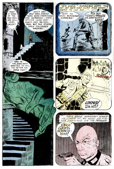
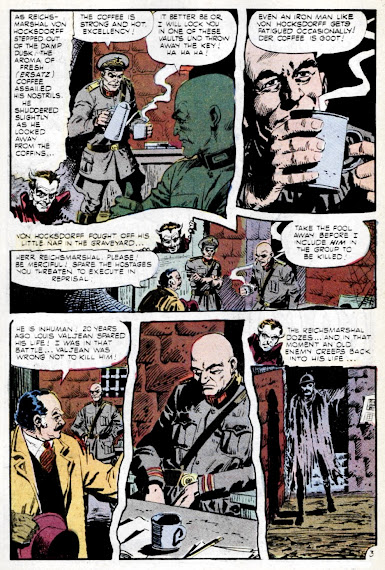
Today's dreary Sunday matinee is another Charlton horror double-feature, a pair of supernatural weird war tales to really wake up your weekend. Both stories are from the Ghostly Tales series, with #55 being the actual April - May 1966 debut issue of its lengthy run. But up first, a really wild Russ Jones jolter from the August 1972 issue of Ghostly Tales #97, (I wonder if Ditko jumped in on that last page?)


I had never seen Poltergeist before, it was chilling, though I can't understand why Mark brought his young son along. If it is a crumbling castle, wouldn't it be dangerous for a young kid to enter? I know nowadays urban exploration and ghost hunting are both sub culture activities, but only fools enter without careful preparation (dust masks, hiking boots, holy water, etc.)
ReplyDeleteBoth This tale and Army of the Dead would have been decent enough plots for Night Gallery or some other anthology show, maybe even Twilight Zone with a bit of rewriting.
Charlton Comics, some love them, some loathe them, I always found them a good read.
The second story was a mess. The art is good though.
ReplyDeletePoltergeist is a ... weird one ... it's basically unresolved. The guy (and he brings his kid along???) goes to the castle, the nazi ghost tries to kill him, and then he leaves the castle.
ReplyDeleteAnd in Army of the Dead, the ghost imitates Von Hocksdorff? I think? I kind of lost the thread and I read it twice; I think I had some trouble telling characters apart.
I guess I can say the writing isn't that hot in both of these. They could have used some editing.
That said, there's a lot of fun to be had in the art. The nazi swastika paneling is really clever, page 4 has a complex but interesting and easy to follow page layout that uses the comic format in a cool way, and the last panel is ... a different artist? A paste up job? Who knows!
Army of the dead is a really competent art job, some interesting paneling, some good camera angle. I like it. Real workman like but good for a horror story.
I've got to agree that it feels like the lines of communication sort of fall apart in that second half of story number two. Like maybe some tightening of the script for page count purposes left vital info on the cutting room floor. Or something. Maybe it's just that the art has trouble telling the story. It certainly wouldn't be the first time I've seen a perfectly decent illustrator (page four is great! And I love all the scratchy ghost effects) really nail the "graphic" part of the job while all but muffing the "storytelling" angle. But what it feels like is the seventies penchant for erring on the side of "showing" and not "telling" sort of over-steered.
ReplyDeleteI really dig that ghostly Charlton house ad!