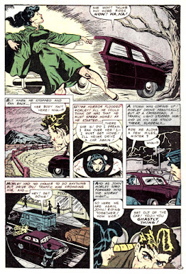
The art is a little bit flimsy at times, but this is a fun one with some nice visual attempts from
A.C. Hollingsworth, and originally appeared in the Oct / Nov 1952 issue of
Eerie #9.
Everett Raymond Kinstler's black and white art for the intro / preface on the other hand is as spectacular as always.


Yeah, every time I see something this awkward and uneven looking--with oddly-proportioned figures, crowded word balloons with mismatched lettering, reused background elements--I imagine there is an interesting editorial story behind it. I would not be at all surprised to hear that this was cut together from another story, or stories, fished from the slush pile, and that Holligsworth was primarily responsible for sanding down the edges between pasted-together elements, drafting a new head or two, and penciling that totally terrific splash panel. Cute story anyway, though. I love hitchhiker folklore! And it's always fun to see someone try to fool the strange forces of the unknown yet again. Pro-tip: you can't!
ReplyDeleteNormally I'm against smoking, but floating skulls don't have lungs so that seems OK!
ReplyDeleteI'm with Mr. Cavin here, this seems a bit pasted up, but the impossible to avoid ghost stories are always entertaining. Some good use of shadows, though that might have actually been used to cover up some changes!
The story splash is awesome, the pencil work is incredible.
Even though it couldn't be an uncommon name, it's had to see the name "Gail Gordon" without imagining the sitcom actor. Sort of like the name "Charro" a few stories back.
ReplyDelete