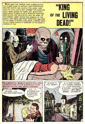
It doesn't get much more pulp action horror overload than the final tale from the April - May '54 reprint issue of Eerie #15 (check the archive for "Werewolf of Warsham Manor!", "Subway Horror!" "Monster from the Pit" --plus other details about this issue's origins = COMPLETE ISSUE!) And speaking of Eerie, check out the new Wally Wood Crime & Horror book coming out later this month!
CLICK HERE!


This comment has been removed by the author.
ReplyDeleteI'm sure Brian will still have plenty to add...
ReplyDeleteGadzooks, I have a rep!
ReplyDeleteDid the artist have one eye? You could teach a "what not to do" class on the perspective problems in the art, and what is more interesting is how good the artist is at drawing the city, and how lovingly s/he draws trash cans, and yet can't be bothered to draw a proper hypodermic needle (unless the art was replaced for some reason.)
Add in the casual sexism "World famous ballerina, pfft, I have toast to make for my husband!" and my favorite panel where they want to say it's a river of poop -- up to his neck! -- but have to dance around it with "indescribable filth", then you have one crazy tale.
Even more odd, though, is the scratchy shading it is pretty unique, and pretty cool. I think we are looking at a landscape artist that tried his hand in comics, there's talent, but it's so focused on architecture and brush technique, and just terrible at other things.
Bad spots or not, the art shines like hell here and there. That second panel of page two is fantastic and evocative, for example; and the last panel of that page needs to be on the cover of a collection some day.
ReplyDeleteYes, so true, plus there is the panel at the bottom of a page where Mr. Austen's face is half blacked out. The most fubar thing I noticed, though, is the great disparity of head sizes. Is that what going to "the brink of hell" does to perspective?
ReplyDeleteThis is a wunderbar tale, though, and after all, it's a simile which draws a compsrison of the King and his zombies with the Commissar and the Secret Police. Of course, the rescuer was a virile American male and the damsel a victim of the Reds.
This is a great tale. Hoo-rah!
Good comments getting to the heart of this tale's merits/faults (which are one in the same!) I've developed an appreciation for haphazard illustration like this. It's almost like comic book folk art. Those head scales are just plain bizarre here. That splash is really quite effective and disturbing because of it. But by the time you get to panel 3 on page 7, it's quite clear that it's not exactly an artistic genius at work, but somebody who just doesn't seem to have a handle on a lot of stuff. Which makes it oddly compelling -- as if he succeeds greatly here and there in spots in spite of himself! Thanks for posting this one, Karswell.
ReplyDeleteDaaang. I don't have any problem whatsoever with this incorrect proportionality you guys keep mentioning. There certainly is something to be said about the pretty clever way this illustrator has mostly made these "mistakes" in places where they happen to convey more in the way of hostility and mood. Frequently the exciting and creepy elements of these panels are drawn out of proportion with the mundane elements--elements often getting crushed or blacked out of the very panel--and that strikes me as a reasonable fidelity to the emotional, rather than the technical, impact of what is happening in the story.
ReplyDeleteI don't think that's a hypodermic needle in the splash, obviously it's one of those black head acne suckers.
ReplyDeleteHope to get the posts more on track this month, super busy lately with work and some other projects. As always, thanks for the comments.
Man, the comments here are just as fun to see as the story and the artwork!
ReplyDeleteI have to agree with Mr. Cavin on the last panel for the second page; that totally caught my attention and I was thinking how great it would be as a glow in the dark poster or something.
I was also wondering about how the monster would be regular sized in one panel, and then a giant in the next. The splash page is the best.
Thanks as always for the efforts, Karswell.