We'll be closing out August 2010 over the next few posts with another full issue from
Harvey Publications, and this time it's the May 1953 issue of
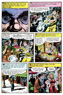
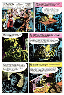
Tomb of Terror #9. Kicking it all off with two tales today, our first is a "stirring" little bit of insanity featuring powerhouse artwork by
THOIA fave
Lee Elias... I've also thrown in a couple neat one-page
Howard Nostrand fillers. Does anyone know who illustrated
"Backwash?"


++++++++++++++++++++++

++++++++++++++++++++++

Fergus can't catch a break!
ReplyDeleteAbout the dame in the 6th panel of the 2nd page and the first panel in the third : I really love her outfit. Also, Carlo is quite the hypocrite, he he. :p
ReplyDeleteAbout the second story : I guess no man really is an island, huh? Plus, talk about the biggest rejects in the world : not even the ocean and the earth want those two bums. Which makes for a humorous turn of events for Dan Fergus.
I wonder if they still eat 100 year old eggs and elephant steak?
I love getting to see these old comics, glad you're giving them a new life! Though they're text-heavy compared to today's comics, the artwork always gives me shivers. :)
ReplyDeleteI really enjoyed Backwash. There were a few panels in there that must have provided some nightmare fuel for the kiddies back then.
ReplyDeleteThat cauldron reminds me, when you were a kid and you'd see witches in movies saying "hubble bubble toil and trouble" did you think they were saying hubble bubble toilet trouble?"
ReplyDeleteYou didn't? er, I... uh... me neither!
I love that blue face in the last panel of the Backwash story.
>not even the ocean and the earth want those two bums.
ReplyDeleteShades of E. F. Benson's awesome horror tale "The Outcast", eh?
>they're text-heavy compared to today's comics
Back in those days WRITERS actually worked on comics too. It's why a story from 1953 can tell a perfectly decent story in 5 pages or less, unlike most modern comics that require a 12 issue year-spanning mini series just to get the same simple point across.
>a few panels in there that must have provided some nightmare fuel for the kiddies back then
Absolutely! "Can horror comics actually be scary?" Of course they can.
>love that blue face in the last panel of the Backwash story.
Actually, that's in the Leopard Man bonus... Nostrand was indeed awesome though.
Thanks for the comments, got a couple more yarns from this issue coming up next as we wind up another month focusing entirely on a single publisher, in this case Harvey Publications. Hope you enjoyed it!
Regarding text-heaviness: I see that it is possible to equate the amount of text with the efforts of the writer and come away with the notion that in these cases we are seeing the equally important participation of the author and the artist. Compared with modern comics storytelling, these text-heavy stories do look unusual. Like the writers of today are undervalued.
ReplyDeleteBut to me it always seemed like a story too weighted with explanatory text is a side-effect of the art and the writing being in competition with one another. The writers of these pre-code stories often seem to demonstrate a lack of faith in their artists' ability to depict the unfolding of a narrative.
Of course, this tell-don't-show method does tend to compress things, as showing can take several panels to illustrate something which can just be written down. But the real authorship of a story happens from panel to panel not in captions--this is where the purest collaboration exists as the artist presents the writer's progression of story. It seems to me it's only a product of shifting storytelling philosophy that has reversed this aspect of comic narrative between the fifties and now.
Five short illustrated text-heavy stories? Or one long graphic narrative? Pack a bunch of ideas between two covers or concentrate on a mood and character development between twenty-four? They both have their pluses and minuses; in the right hands either can be pretty awesome.
The story "Backwash" has a very surreal, dreamlike quality to it. Instead of your garden variety decayed corpse come to life, these reanimated corpses become more grotesque with each appearance without actually appearing to decay. At this point the reader could also assume that the corpses don't exist at all, but are the imagination of Fergus, and represent his conscience.
ReplyDeleteAs always, nicely said Mr C! Anyone else have any thoughts on this? I remember when I was a kid I was put off by comic books with lots of text cramping out the art... but then as I got older I almost completely reversed that opinion because it felt like the more story I actually got, the more I got my money's worth.
ReplyDelete>the reader could also assume that the corpses don't exist at all, but are the imagination of Fergus
Interesting thought Anon, thanks for the comment! Harvey artists were masters at creating "surreal, dreamlike" horror stories, amd though they seem to be more remembered as the publisher that swiped from EC the most, I still think they had some amazing chops on their own right too.
More harvey coming up!
talk about stingy! Dan Fergus is obviously wealthy but can't be bothered to have his teeth fixed!...
ReplyDeletegreat art on both, Backwash being especially creepy in content.