From the January 1952 issue of Web of Evil #2
++++++++++++++++++++++++
I also want to give a shout-out to Bone Daddy Fred and his great new blog Sweet Skulls. Having completely given up on Monster Memories just as it got started (?!!), Sweet Skulls goes for a more specific attack and is more fun than an overflowing barrel of spinal remains, 100% chock full of what every horror fan truly loves most—SKULLS, SKULLS, AND MORE SKULLS!!
So pull up a chair, peel back your face mask, and dive in (skull first of course) by clicking HERE!


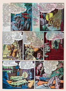
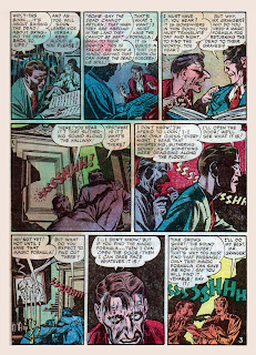
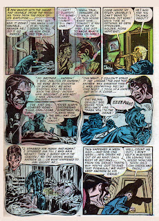
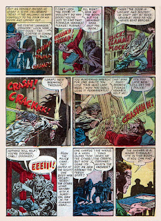
Not exactly original,but under Cole's hands it becomes a near masterpiece of suspense and atmosphere,i'll just consider it an adaption that forgot to give credit.also,i'm sorry about donating Karswell,im in a bit of a financial jam myself,might be moving in a month.
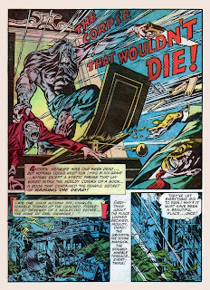
ReplyDeleteWow! Another super-groovy opening splash page image set up this tale by Cole.
ReplyDeleteHe really knew what he was doing, didn't he?
I agree with Horror Pariah , a "standard" tale of vengeance from the grave becomes a real masterpiece in Cole's hands !
ReplyDeleteAnd oh , by the way , I also agree with Chuck , the splash page is SUPER !
Karswell,
ReplyDeleteThanx for the Sweet Skulls mention and cool graphic! I do appreciate it.
Worst. Job interview. EVER.
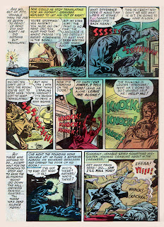
ReplyDeleteAgree with the great art comments here--and while the story wasn't as wild as some, I really dug some of the nice creepy touches, like the "Haunting"-esque knocking at the door, and the Poe-like character driven mad by the occult.
So what do you think of casting Ralph Fiennes as Carl? From some angles it looks like a perfect fit.
And what about those gnarly toes at the bottom of pg. 2? I haven't seen digits like that since I attended the Duke's last pedicure party!
The splash page is definitely the best thing about this story--reminds me of Madman, which I've been thinking about a lot lately (stay tuned!). If the Saw franchise had gone THAT route, then we'd have had something...
AM I REALLY THE FIRST ONE TO SAY THE SPLASH IS EXPLOSIVE? GOD LOOK AT THAT IMAGERY!! AND AS MUCH AS I HATE ALL THE MUSCLE BEFFCAKE OF SUPERHERO COMICS, THE PHYSICAL FORM ON THIS GUY IS EXPERTLY ILLUSTRATED, THE SHADING AND INKING AND EVERYTHING. HE LOOKS LIKE HE COULD SERIOUSLY F-UP THOR!
ReplyDeleteGREAT POST! COLE IS MY NEW SUPERHERO!
The splash page is definitely the best thing about this story
ReplyDeleteThat's how I felt. The story was good, but the splash made me expect a Silver-Surfer-type corpse wreaking havoc from atop a flying door. Man, that would be too cool for words.
But what's up with the hand saw? Since when do the dead need hand tools to exercise vengeance?
>>Since when do the dead need hand tools to exercise vengeance?
ReplyDeleteHe doesn't need it. He just wants it. Because that's how f-ing hardcore he is.
Death seems to have functioned as a kind of steroid for the genius, bro, though. :)
cool story....... that one guy is right its totally madman
ReplyDeleteWhat's up with the saw, you ask? What's up with the SAW?!!! Haven't you ever sawn off someone's head? Good grief, hasn't anyone learned anything from all these pre code comics...
ReplyDeleteAnyway, more Cole tomorrow and the next day... Friday I have a totally appropriate Lou Cameron tale lined up for the 13th so it's not really a Jack Cole "Week" after all. Weak.
What an explosive splash page.
ReplyDeleteI've never seen this Cole horror work before, but gawd I love the artist!
Hangman's Horror is gorgeous too!
Thanks Karswell!
Ha, corpse with a saw
ReplyDeleteCame back to this one because it was referenced in a recent post ("Make-Up for Death"). It's *definitely* an uncredited adaptation of CAS' "Return of the Sorcerer"! And if any of you want to see an official adaptation, there's one by Richard Corben here.
ReplyDelete